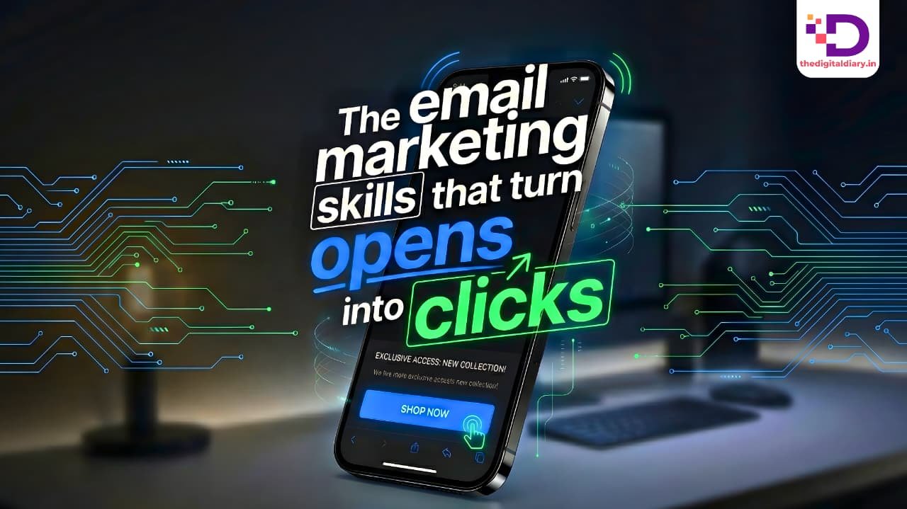
Email marketing no longer sits comfortably on desktops.
It lives on phones.
People read emails while waiting for cabs, standing in queues, or scrolling between meetings. That shift changed everything. With mobile-first indexing now standard and AI reshaping how brands personalize communication, marketers can no longer treat mobile optimization as an afterthought.
The data makes that clear. Research from Audience Point shows that 50–60 percent of emails now open on mobile devices. More people read emails on their phones than on laptops. That reality forces a rethink- design, copy, timing, even tone.
Marketers want engagement.
They want acquisition.
They want clicks that actually lead somewhere.
The path forward looks clear. Mobile-first email marketing; supported by AI-powered personalization.
In this guide, you’ll learn how to:
- Use pre-header text to influence opens on mobile
- Design buttons that work for thumbs, not cursors
- Apply device detection for smarter email experiences
- Create layouts built for mobile reading habits
- Measure email performance with mobile behavior in mind
Why Pre-Header Text Carries More Weight Than You Think
Most marketers obsess over subject lines. Fair enough. Subject lines still matter. But pre-header text often decides what happens next.
Pre-header text appears beside the subject line in inbox previews. On mobile screens, it sometimes shows more clearly than the subject itself. When marketers ignore it, they waste valuable space.
Pre-header text should not repeat the subject line.
It should support it.
Add context.
Add clarity.
Sometimes add urgency.
Keep it short.
Keep it readable.
Keep it human.
Different devices display different character limits. That’s why punchy copy works better than clever phrasing. This is also where AI helps not by replacing writers, but by speeding up testing.
Personalization changes the impact entirely. Research from Drip shows that personalized emails achieve significantly higher open rates than non-personalized ones. When pre-header text reflects behavior, location, or past engagement, it feels relevant instead of automated.
Tools like Klaviyo and Mailchimp now allow dynamic pre-header testing at scale. That flexibility matters as attention spans continue to shrink.
Why Buttons Outperform Links on Mobile
Mobile users don’t click the way desktop users do.
They tap.
Text-heavy emails struggle on small screens. Inline links demand precision. Buttons remove that friction. They stand out. They guide the eye. They invite action without forcing it.
Place the primary CTA early. Not buried. Not hidden after long paragraphs. Many readers won’t scroll far, especially on mobile.
Button copy matters more than design tricks. Action-oriented phrases work best when they explain what happens next. “Download now.” “Get early access.” “Shop the collection.” These phrases set expectations without sounding pushy.
Design still plays a role. Adequate spacing, readable text, and clear contrast make buttons easier to tap. Small details often decide whether a click happens or not.
How Device Detection Changes the Email Experience
Responsive templates helped email marketing survive the mobile shift.
But survival isn’t the same as performance.
Device detection goes further. It allows emails to adapt content based on how people open them—mobile, tablet, or desktop.
This matters when journeys differ. A mobile user may prefer a simplified checkout or a single prominent CTA. A desktop user may want more detail. Device detection allows both experiences to coexist.
AI takes this further. Machine learning analyzes behavior patterns and adjusts timing, content, and layout automatically. When the goal shifts to app installs or repeat purchases, AI helps identify when and how to prompt action—without guesswork.
Designing Emails with a Mobile-First Mindset
Mobile-first design does not mean shrinking desktop layouts.
It means starting with mobile behavior.
People skim.
They scroll.
They decide fast.
Single-column layouts support that behavior. Larger fonts reduce effort. Short paragraphs keep attention moving. Visual hierarchy helps readers understand what matters without thinking too hard.
Most email clients render best between 600 and 800 pixels wide. That range supports clean previews across devices. Previews matter. People often decide within seconds whether an email deserves attention.
The layout either helps that decision.
Or it doesn’t.
Measuring What Mobile Readers Actually Do
Optimization without measurement leads nowhere. Once emails work well on mobile, marketers need to track what happens next.
Mobile open rates tell one story. Click-through rates tell another. Engagement time and scroll depth reveal how readers behave after opening an email.
Email also generates valuable first-party data. Over time, those insights shape smarter personalization, better timing, and more relevant messaging across campaigns.